Week 18 Milan Art Institute Mastery Program
Welcome to week 18!
I swear this week took me two weeks to get through.
This week we worked on creating our Pinterest boards and we created three boards which was ‘Artwork to Emulate’ ‘My Personal Aesthetic’ and then ‘Artwork that I Want to Live With’. The artwork that I want to hang in my home should be quite different from the artwork that I want to emulate or a personal aesthetic, she didn’t really say why exactly or where this is going, but I think the idea is to get an understanding of what I like that’s quite different from my own work.
The personal aesthetic board was to help us identify what we like to look at and I thought it would be full of artwork that I like, but actually it’s more based around photography that punches me in the gut. After adding images, I went back to have a look at the board as a whole… and the whole board is pretty much landscape photography in jewel towns, high contrast, with a lot of pathways or roads in the centre that lead off into the distance.
It’s not at all the subject matter I like to paint. It’s more about what visually punches you in the gut, that you have a visceral reaction to.
The artwork that I want to emulate was full of painting which, maybe I like the way they lay down the paint, or maybe I like the colour combinations, or the layers, or the line work. When I added an artwork to that board I wrote notes of what about that piece I wanted to try.
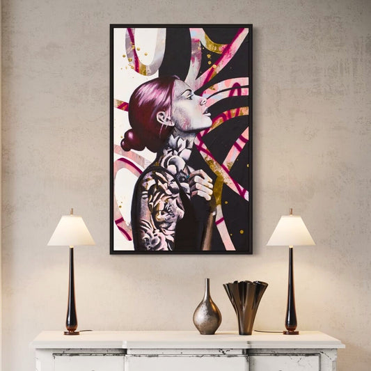
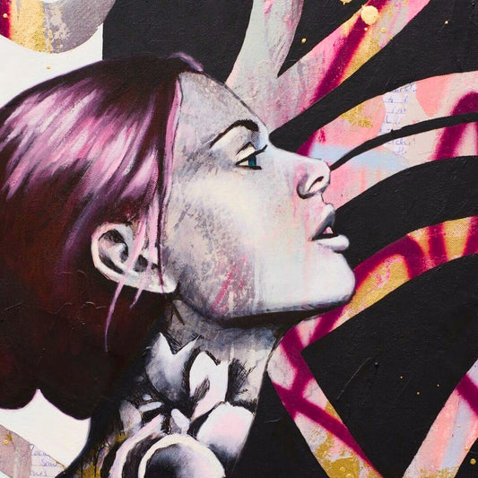
In the studio we learned how to work with inks and to work on paper.
Especially if you’re doing oil painting, it’s important to seal the paper, otherwise the oil absorbs into the paper and it will rot the paper. I have painted on paper before with acrylics and mixed media but I didn’t quite realise how different it is to work on a sealed piece of paper.
Before, I was using acrylics like watercolours. They would soak into the paper, and I really like that aspect of working on paper because I can’t get that sort of effect on canvas.
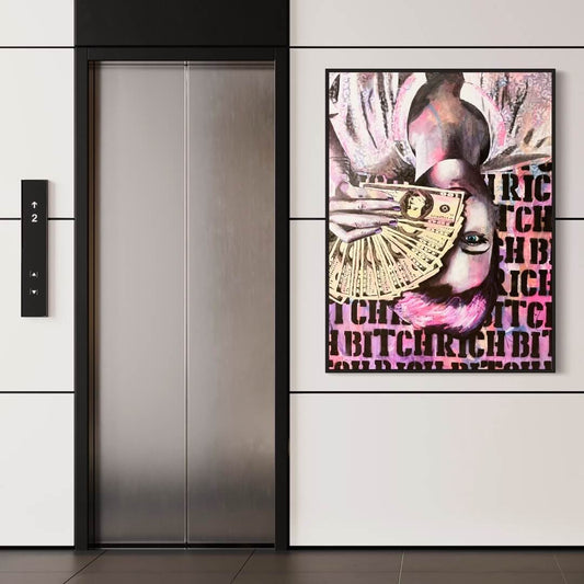
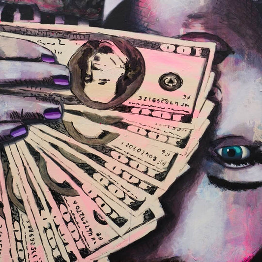
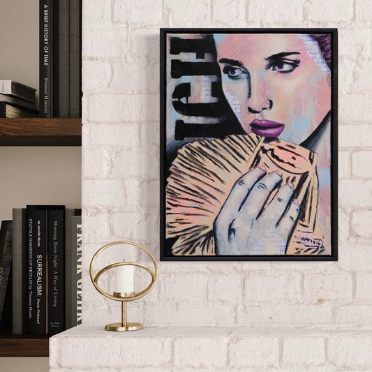
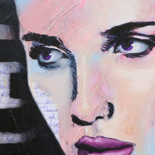
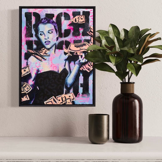
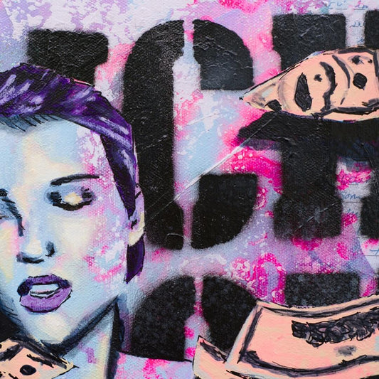
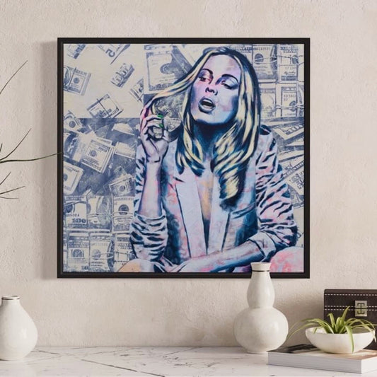
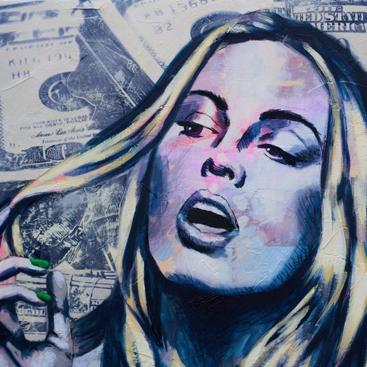
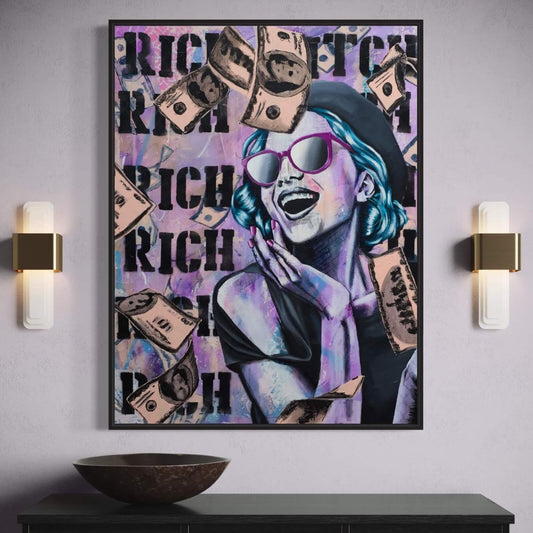
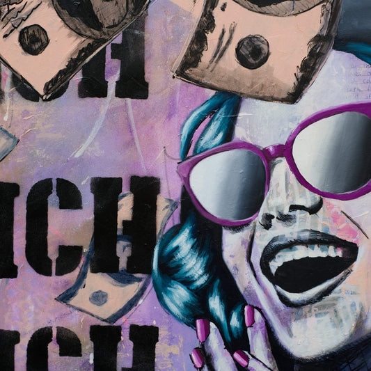
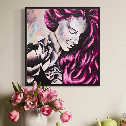
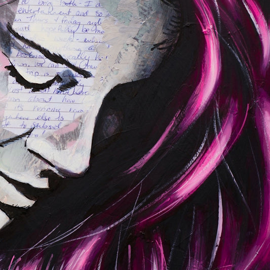
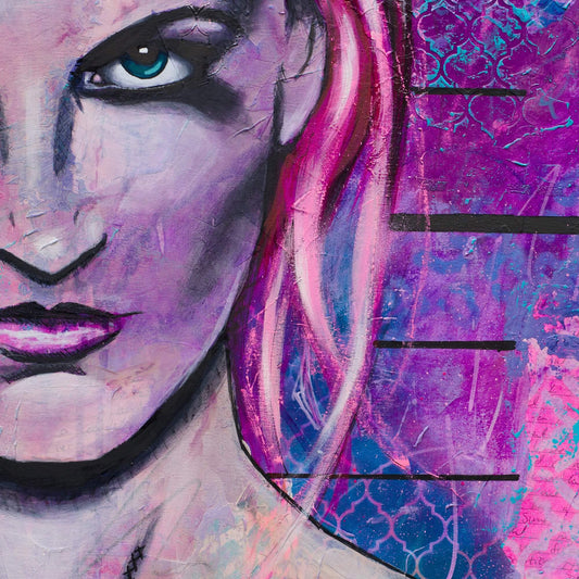
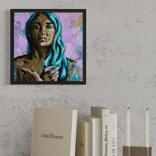
To practice with inks and acrylic on paper we created two pieces, trying different approaches to to be able to do a lot of different experimenting. On my pink piece I really like the background because it was done very lightly, so that when I put the image over the inks, the background didn’t interfere too much with the image.

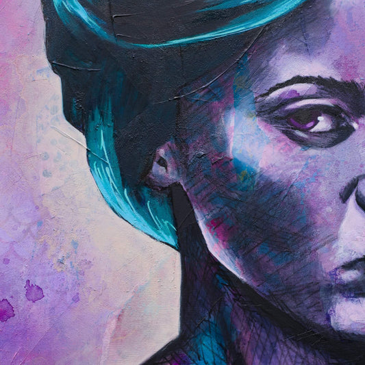
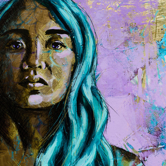
But on the other one I put black ink all over, which made it difficult for the face to read properly. And in order to get the darks, mids, and light tones in the correct place I ended up pretty much just painting over all the background.
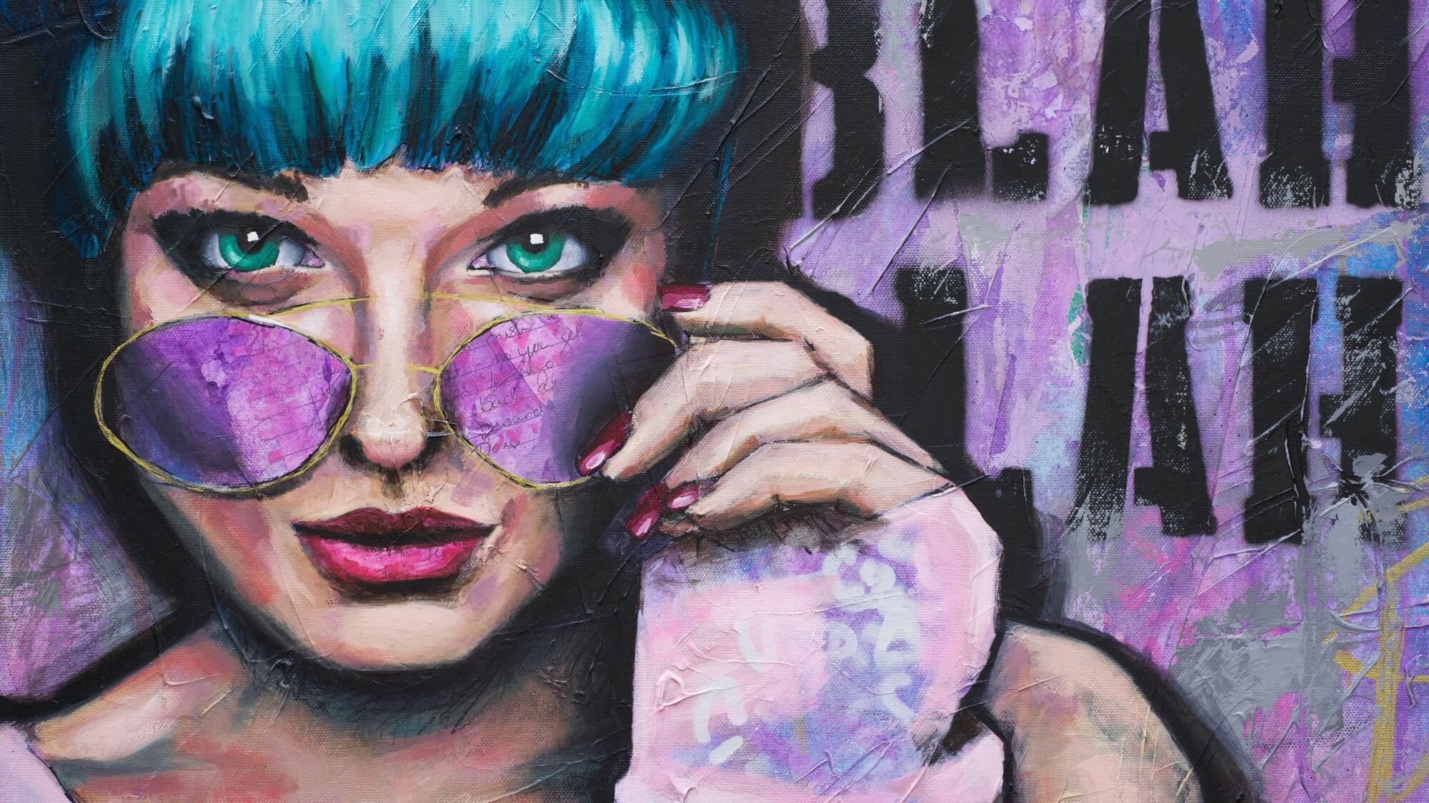
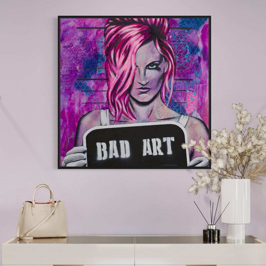
I don’t like the purple and green one as much as the pink one, as it’s rendered a bit more realistically, but it was fun to play with neon green in her hair to see how vibrant it comes out.
It’s starting to take a lot more time to get through the week than it did in Part 1. In the Oil Painting and Drawing Section I was spending about 15 hours a week on this course, but now I feel like I’m getting slower and spending the full 20 hours a week.